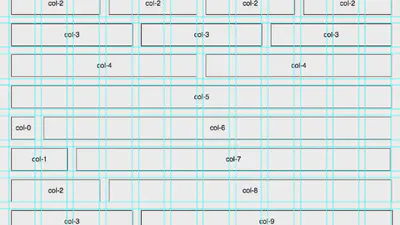
After a lot of consideration, struggle and annoyance I finally gave in and decided to use a pre-existing tool for the timeline section of my front page. I looked a few different contenders in this final pass. Essentially, I came to the realisation that I would not be able to learn the requisite Javascript in order to build something sophisticated enough from scratch. I did a bit of trying out in this jsFiddle project, but kept running into deadends (this project is in a partially built state - so please do not judge me - the javascript is largely erased by this point): https://jsfiddle.net/43gg6x3v/7/ Initially I found only jQuery examples - but as I have previously stated, I really wanted to work with Vanilla Javascript, due to load times, future proofing the code content. I also feel that it will be more beneficial to my learning to stick to learning Vanilla Javascript (or rather Ecmascript 6) so that I truly get the language prior to becoming too invested in specific frameworks. Also having looked at these two resources: jQuery vs. Javascript gist and then the From jQuery to Javascript: A Reference - vanilla makes much more sense to me.
25 Nov, 2016
After starting my initial experiments/prototypes for the portfolio project from a boilerplate I decided that I wanted to build my own responsive CSS grid from scratch. The grid turned out fairly well although there are some very slight issues with the column alignment which I need to sort out. I also still need to add the mobile device break points. I did find it very helpful to make use of the CSS calc() function to actively resize widths in percentages based on window size (calc()., 2016). This is a fantastic function although the support for it isn’t universal yet (82.73 according to caniuse.com). Having said that I did try my grid in Safari to see how it behaved in an unsupported browser and I was pleased with how well it resized.
22 Nov, 2016
This post displays iterations of wireframe 2. In this wireframe, I took ideas from wireframes 0 and 1, but removed the next buttons in favour of a timeline at the top of the page. The top section of the page, containing the timeline, is shown as overflow (beyond the width) of the page to indicate the dynamic content. Clicking on the years, and circles on the timeline is intended to swap out the slide content and information in the centre of the timeline section. The arrow buttons on the left and right were also intended to switch between the content slides. These buttons ideally would also be operable via arrow keys on the keyboard.
20 Nov, 2016
The title of this blog post is a nod in the direction of Mr. Gary Numan. It felt like the right time to get some simple mock-ups ready in Adobe Fireworks; thus we became electric and moved away from paper, but only temporarily as this will speedup some of the low-fi paper prototypes that I plan later on. Fireworks seemed like the best choice as it is javascript-centric and I think that in all likelihood the final product would be coded in Bootstrap JS (but that would be up to my hypothetical developer). This is going to be a very long journal entry as there were a lot of decisions involved in taking the jump to the new format. Bear with me. So first on my list, although I did it second (as I ’think’ in colour) was to create a flexible frame-based mock-up of a topic page where learning content would be delivered. The frame size is set to 805 X 604 as this is the size of the window typically specified by Xerte, the University of Nottingham’s Learning Object creation tool. The specific Xerte example that I drew inspiration from can be found at the following link: http://www.nottingham.ac.uk/toolkits/play_8203. You will see that my progression buttons at the bottom of the page bears some resemblance to theirs, as I felt that it was an elegant solution to the problem in both a browser window and on a mobile device. I would be sure to cite this in my final code! However, I do think that a bit of polishing is needed and possibly an alternative for testing purposes; I think that the “2 / 4” looks like a button too, which could lead to confusion, so that is something to fix.
8 Jan, 2016
Well almost… I have had a #UX category on this blog for a while, but I have decided to formalise it as I embark on a grad school module, Interaction Design and Evaluation Process. The UX category will be a place to collect my thoughts in relation to what I learn on the module and can be viewed in a collated format via the “UX” tab. Things to comment on this week:
11 Oct, 2015