Building the grid
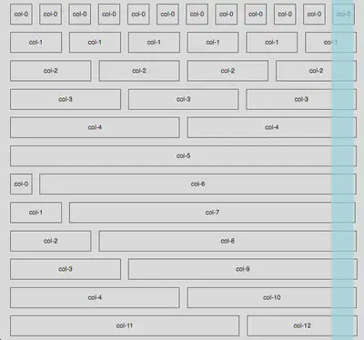
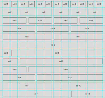
After starting my initial experiments/prototypes for the portfolio project from a boilerplate I decided that I wanted to build my own responsive CSS grid from scratch. The grid turned out fairly well although there are some very slight issues with the column alignment which I need to sort out. I also still need to add the mobile device break points. I did find it very helpful to make use of the CSS calc() function to actively resize widths in percentages based on window size (calc()., 2016). This is a fantastic function although the support for it isn’t universal yet (82.73 according to caniuse.com). Having said that I did try my grid in Safari to see how it behaved in an unsupported browser and I was pleased with how well it resized. [caption id=“attachment_200” align=“alignnone” width=“919”]
References
Calc(). (2016, May 17). Retrieved November 22, 2016, from https://developer.mozilla.org/en-US/docs/Web/CSS/calc
Can I use… Support tables for HTML5, CSS3, etc. (2016, October 23). Retrieved November 27, 2016, from http://caniuse.com/#search=calc
Drewniak, J. (2014, November 6). Creating your own CSS grid system. Retrieved November 25, 2016, from http://j4n.co/blog/Creating-your-own-css-grid-system
Gamache, D. (2016) A dead simple, responsive boilerplate. Retrieved November 25, 2016, from http://getskeleton.com/
Imling, M. (2016). One% CSS Grid. Retrieved November 25, 2016, from http://onepcssgrid.mattimling.com/
Rand-Hendriksen, M. (2015, July 16). Making sense of the CSS box model. Retrieved November 25, 2016, from https://www.lynda.com/CSS-tutorials/Making-Sense-CSS-Box-Model/372544-2.html
H5bp/html5-boilerplate. (2016, November 17). Retrieved November 25, 2016, from https://github.com/h5bp/html5-boilerplate
Fiona MacNeill
Learning Consultant &
UX Researcher
Passionate about creating inclusive and accessible experiences, tools, and services for learning and doing.