Business Model Canvas and more tweaks
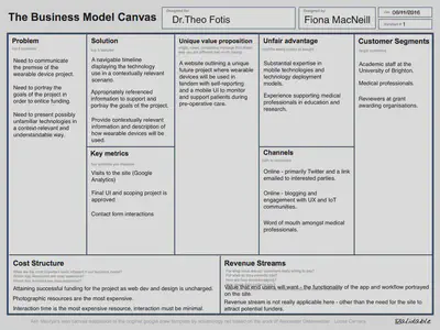
- I have completed an initial version of the Lean Business Model Canvas, as mentioned in my earlier post referencing UX documentation and design artefacts. I obtained the template recommendation in Cao & Bank’s (n.d.) book on UX documentation (the template is available at this URL: http://www.uoguelph.ca/cbase/resource-library/wp-content/uploads/2014/05/Lean-Business-Model-Canvas-template.pdf).
- I have asked my friend Jason to take a look at my code for the arrow button navigation, so I will work on some more tweaks to that tomorrow.
- Due to extremely limited time this week as a result of some unanticipated work commitments, I haven’t got as much development work in as I would like. So I have focused on a few fixes on this site as they were smaller thinks that I could achieve in the time that I had.
- I removed a superfluous hyperlink in the footer.php - it was a copy and paste mistake.
- I decided not to “provide a choice of fonts” (see last post) as it felt like it might offer too many options.
- I decided to install the WP Accessibility Plugin - I have worked with it before and found it to be one of the best plugins in this area. It offers user-facing tools and some javascript additions to fix common issues in WordPress. Even though I have an accessibility tagged theme, there are additional tweaks that can be completed such as removing title attributes in areas where they aren’t needed and enforcing alt tags. It also allows you to add an active link highlight, which I am initially trying out with a contrast tested purple colour (essentially it puts a box around any active element).
- I worked on a few customisations of the plugin:
- I added it to a sidebar widget instead of the toolbar that is typically used with the plugin. This is mainly due to some issue with the display of the toolbar and also it made sense to present the accessibility options above the background colour options.
- I customised the font-family and font-size of the text in the accessibility widget.
- I enabled the high-contrast and font-size (large text) options as part of the WP Accessibility Plugin.
- I customised aspects of the large text display so that it worked better with the theme, initially some text was too and some was too small. For example, H2 was a too small in comparison to the paragraph text and stylistically and readability-wise it wasn’t great.
- I also changed the text-transform settings on the widgets header text as I noticed that these were all uppercase. This is not the best for Dyslexic readers according to Gov.uk’s recent accessibility posters (https://github.com/UKHomeOffice/posters/tree/master/accessibility/posters_en-UK). I find this series of posters to be very helpful cheat-sheets for accessible design.
- Related findings:
- Gov.uk Accessible Blog: Dos and don’ts on designing for accessibility
- Gov.uk Government Digital Service: User testing accessibility
- Gov.uk Advisory: Making your service accessible
- Related findings:
- Also in my travels I found the Web Accessibility Evaluation Tool (WAVE) - this was recommended both by the WP Accessibility Plugin authors in the documentation and on the Gov.uk page above on the “making your service accessible” page.
- The report (although it will change as the site is being updated) http://wave.webaim.org/report#/http://www.fionamacneill.co.uk/blog/ WAVE highlighted some more bits that I need to work on and I do still need to look at the contrast of the text in comparison to the background in the different colour schemes. The “making your service accessible” page states that automatic tools like WAVE can only detect a proportion of issues (around 20%-30%: https://www.gov.uk/service-manual/helping-people-to-use-your-service/making-your-service-accessible-an-introduction). So I need to ensure that I don’t regard these tests as exhaustive moving forward.
I feel that I have learned quite a bit about accessibility through my work on this journal site, as well as honing my existing skills. So I will take these ideas and techniques forward with me as I continue to work on my portfolio project.
More to come on the to-do list:
- concept document
- Task scenarios
- Business Model Canvas
- General characteristics for user groups
- [Tentative plan] create a UML2 diagram
- A paper prototype – the prototype may actually need to be made in a prototyping tool so that Theo and I can discuss it via email. So probably a change of plan on this one.
References
Cao, J. & Bank, C. (n.d.). The guide to UX design & documentation process. Retrieved from https://www.uxpin.com/studio/ebooks/guide-to-ux-design-process-and-documentation/
Fiona MacNeill
Learning Consultant &
UX Researcher
Passionate about creating inclusive and accessible experiences, tools, and services for learning and doing.